Trends
Introduction
Goal
Find interesting trends in the stream of visitors to your sites.
Overview
The Trends tab in the Audiences perspective consists of two columns. The left columns contains two filters: time period and visitor segment. The right column displays the data in the form of a graph and a "peak performing" list.
Filters
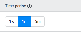
Time Period
This filter allows you to select the time period for which to display data. You can select either the past 7 days (1w), the past 30 days (1m) or the past 90 days (3m).
Visitor Segment
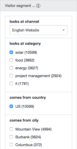
This filter allows you to narrow down a visitor segment for which to display data. Data for the selected segment will be displayed in addition to the data for all visits, so you can compare them.
Narrowing down a visitor segment is done by selecting certain facets of the visitors such as "looks at category", "comes from country" and "comes from city". Multiple values can be selected if it makes sense for a facets. For example, a visitor can look at multiple categories, but can only come from one country. Selecting multiple countries would shrink the selection to the empty set, so you can't do that.
Graph
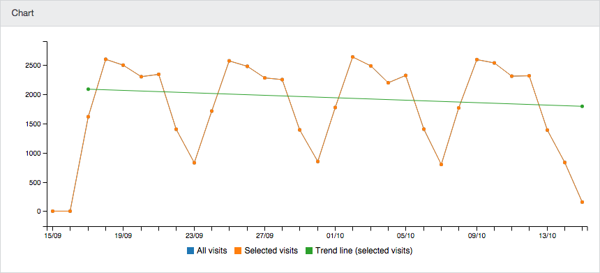
The graph plots the number of visits against the selected time period, as well as the general trend (upwards, downwards).
If no visitor segment has been selected, the graph shows all visits:
If a visitor segments has been selected, the graph shows the visits for the selected segment in addition to the all visits so you can compare them:
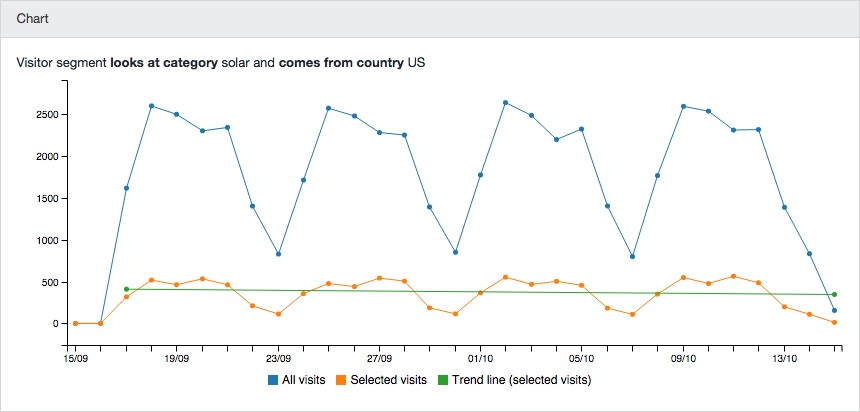
To hide the All visits line altogether, you can click on its legend item.
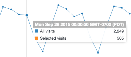
Hovering the mouse pointer over a data point results in a pop-up showing detailed numbers for that data point:
Peak Performing
The Peak Performing list displays items that stand out in some way for the selected time period and visitor segment.
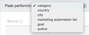
Above the list, you can select one of a number of facets, corresponding with the available facets in the visitor segment filter. For example, "peak performing category" or "peak performing country".
If no visitor segment is selected, the list will show the number of visits and the percentage of all visits for each item:

If a visitor segment is selected, the list will additionally show the percentage of the selected segment for each item, and a score of 0 to 5 stars:
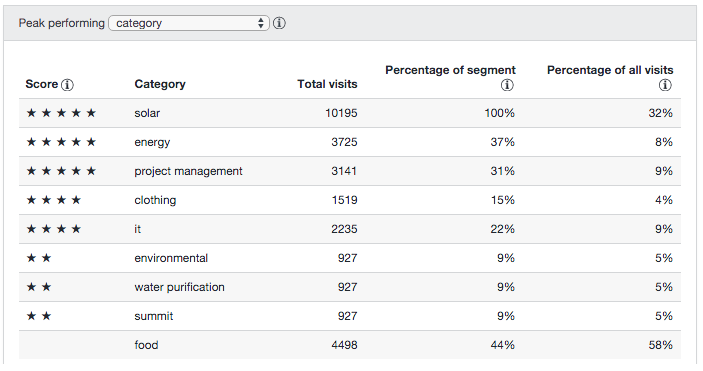
The score reflects how much the item stands out: it is high when the item represents a large number of visits, or if the item occurs significantly more often in the selected visitor segment compared to all visitors. See Trends Scores for more details on the way the scores are computed.
Example
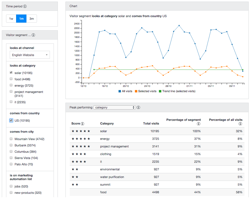
In the screenshot below, we have selected visitors from the US who have looked at content labeled 'solar' in the last month:

Notice the following:
- In the visitor segment filter:
- Under "looks at category", 'solar' is selected but other categories are still visible and selectable. Visitors can look at several different categories and you may be interested in the segment that looks at a particular combination of categories.
- Under "comes from country", 'US' is selected. While one country is selected, no other countries are shown because a visitor can only be from one country. Selecting two countries at the same time would reduce the visitor segment to an empty set.
- Under "comes from city", only cities in the selected country ('US' in this example) are visible and selectable.
- The chart shows how visits in the selected visitor segment compare to all visits.
- In the peak performing list:
- The facet "category" is selected in the dropdown.
- The list shows the categories with the most noteworthy performance within the selected segment.
- Category 'energy' is looked at in 37% of the selected visits compared to 8% of all visits. This difference earns it the maximum number of 5 stars.
- Category 'food' is looked at in 44% of the selected visits compared to 58% of all visits. This difference is too small to earn it any stars.
- Category 'solar' is at the top of the list with a spectacular 100% but that's just because we're filtering on 'solar'.

