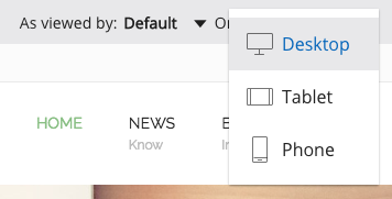
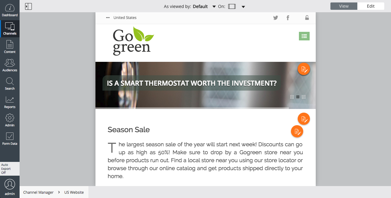
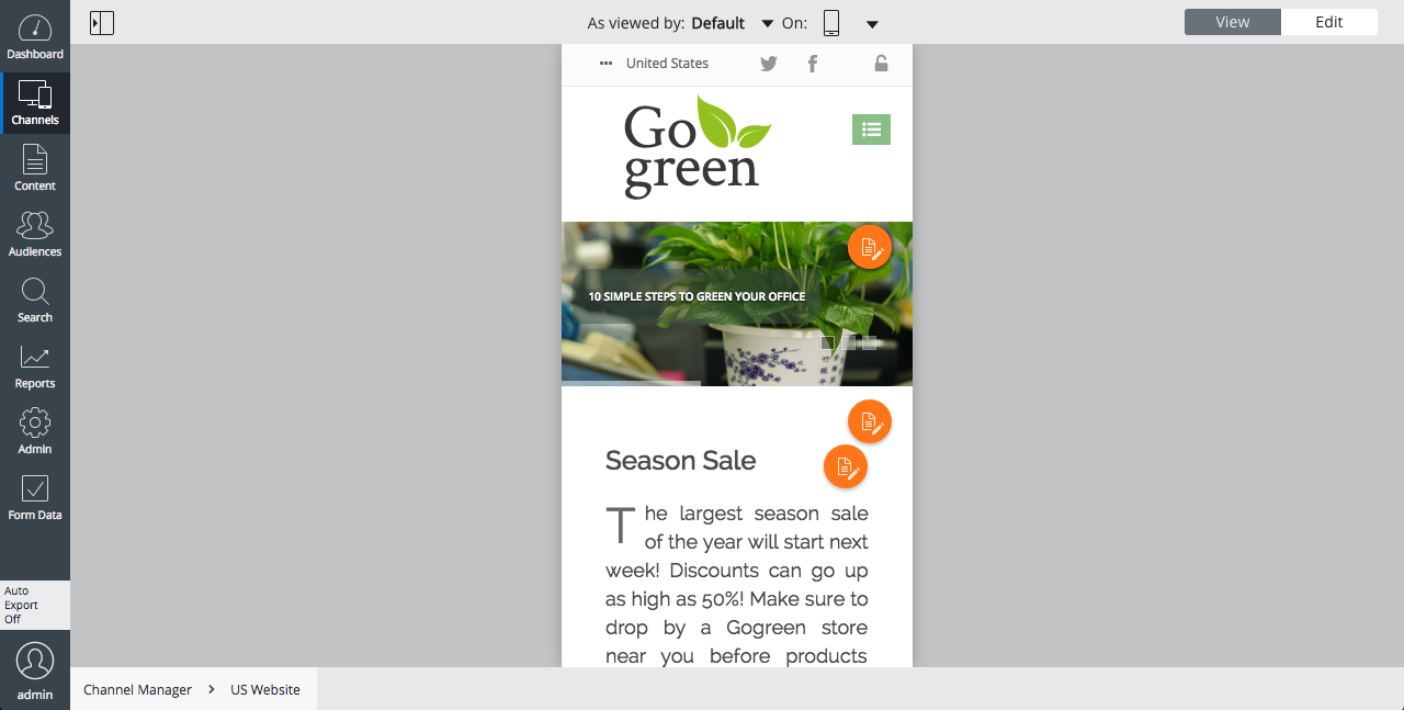
This article covers a Bloomreach Experience Manager version 11. There's an updated version available that covers our most recent release.

Device Preview

The Template Composer allows you to preview the pages of a channel for a number of viewport widths, in order to give CMS users an idea of how their website will look on other devices than monitors, such as tablets or smartphones. The Template Composer provides the following, fixed set of viewport widths:

  • Desktop (monitor, unbound)
  • Tablet (720px)
  • Smartphone (320px)

You can select from these viewport widths using the drop-down in the center of the Template Composer's toolbar.

Did you find this page helpful?
How could this documentation serve you better?
On this page
    Did you find this page helpful?
    How could this documentation serve you better?

    We rely on cookies

    to optimize our communication and to enhance your customer experience. By clicking on the Accept and Close button, you agree to the collection of cookies. You can also adjust your preferences by clicking on Manage Preferences. For more information please see our Privacy policy.

    Manage cookies
    Accept & close

    Cookies preferences

    Accept & close
    Back