Device Preview
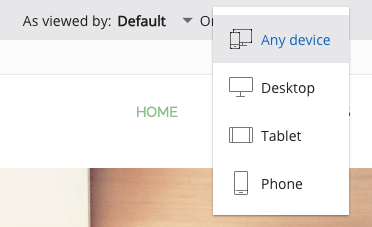
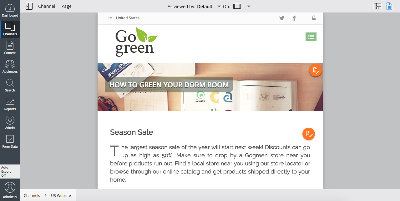
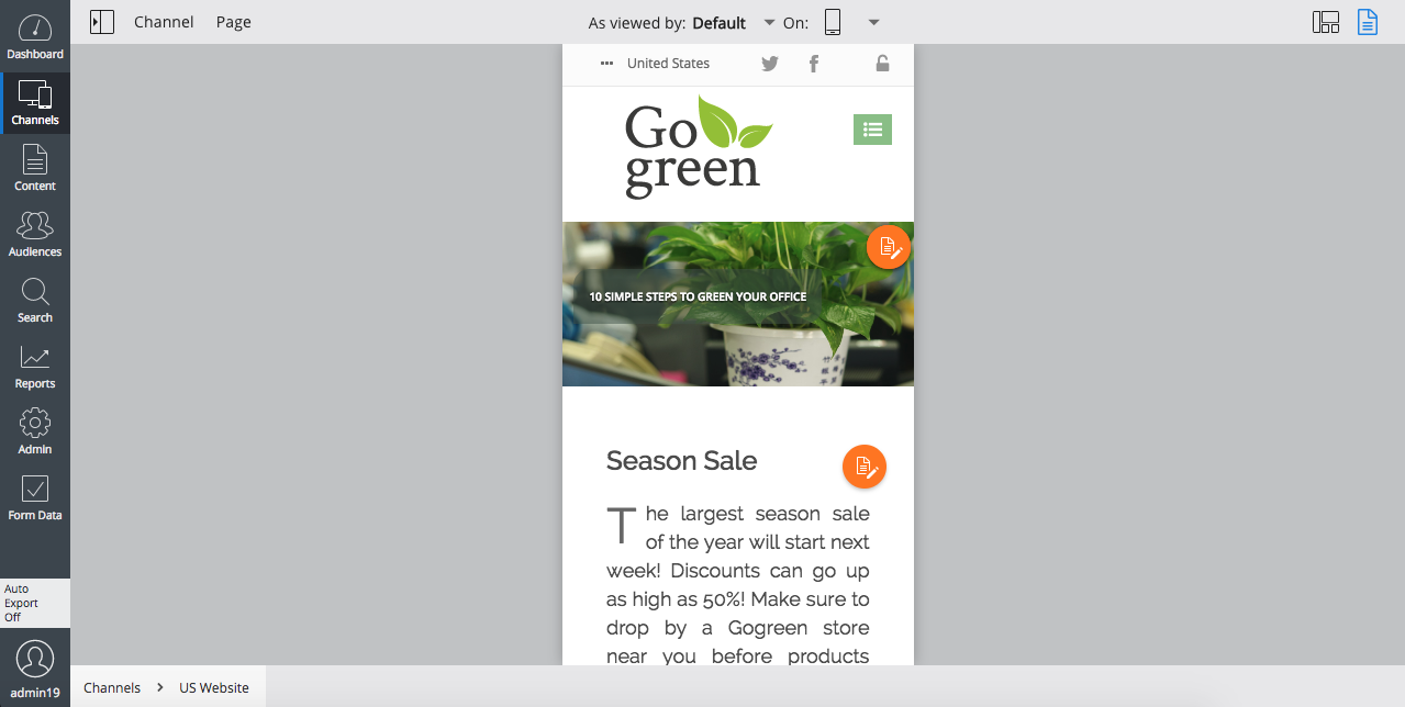
The Channel Editor allows you to preview the pages of a channel for a number of viewport widths, in order to give CMS users an idea of how their website will look on devices other than a monitor, such as tablets or smartphones. The Channel Editor provides the following, fixed set of viewport widths:
- Responsive (unbound, page reflows when resizing the window or opening side panels)
- Desktop (defaults to 1280px)
- Tablet (defaults to 720px)
- Smartphone (defaults to 320px)
You can select from these viewport widths using the drop-down in the center of the Channel Editor's toolbar.


Configure viewport widths per channel
The default values of the viewport widths "desktop", "tablet" and "phone" can be overridden on a per-channel basis. In order to do so, you can add values to the multi-valued hst:devices property of a channel's hst:channel node. Each value should specify the viewport width option and the desired width in pixel units, separated by a colon. For example, to set the viewport width for the "tablet" option of channel "test" to 768px, add the following property value in the CMS Console:
/hst:hst:
  /hst:configurations:
    /myproject-preview:
      /hst:workspace:
        /hst:channel:
          hst:devices: [ ..., tablet:768px ]
Note that /hst:hst/hst:configurations/myproject-preview is only created after you open the channel preview for the first time.
To make the change permanent, add it to your repository data module using a YAML definition.
Prior to version 11.2, the Channel Editor supported the following fixed set of viewport widths:
- Desktop (monitor, unbound, similar to the Responsive mode)
- Tablet (720px)
- Smartphone (320px)

