Define a Custom Document Editor Layout
Introduction
Goal
Define a custom layout that can be used to present document types in the document editor.
Background
In the Document Type Editor, document types can be created and edited. A document type consist of
- the fields, their type and their order
- the layout in which documents of that type are presented to an author in the document editor
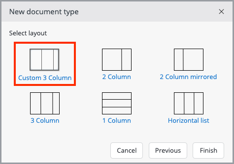
The layout of a document type is selected when a new document type is created. The default layouts are '2 Column', '2 Column mirrored'*, '3 Column'*, '1 Column' and 'Horizontal List'. This page explains how to add a custom layout to those options.
* The '2 Column mirrored' and '3 Column' layouts are available since Bloomreach Experience Manager 13.2.0.
Example: Custom Three Column Layout
You will create a 'Custom 3 Column' layout that can be selected when creating a new document type:

1. Layout Index File
First, add a layout index file to the cms module of your project with the name of the layout: example.CustomThreeColumn.
cms/src/main/resources/hippoecm-layouts.xml:
<?xml version="1.0" encoding="UTF-8"?>
<layouts>
  <layout>
    <plugin>example.CustomThreeColumn</plugin>
  </layout>
</layouts>
2. Layout Descriptor
Add the layout description in the example package within the CMS resources:
cms/src/main/resources/example/CustomThreeColumn.layout.xml:
<?xml version="1.0" encoding="UTF-8"?>
<layout>
  <pad name="left" orientation="vertical" />
  <pad name="middle" orientation="vertical" />
  <pad name="right" orientation="vertical" />
  <transition name="left-middle right" source="left" target="middle" />
  <transition name="middle-left left" source="middle" target="left" />
  <transition name="middle-right right" source="middle" target="right" />
  <transition name="right-middle left" source="right" target="middle" />
</layout>
The descriptor defines three 'pads' in the layout that can contain fields: left, middle, and right. The 'transition' elements define how fields can be moved from one pad to another. The names of the transitions should be unique. These names are also used as CSS classes on the rendered icon that trigger the transition; including 'left', 'right', 'up' or 'down' in the name ensures that the proper arrow icon is rendered.
3. Layout Markup
Add the layout markup next to the descriptor:
cms/src/main/resources/example/CustomThreeColumn.html:
<html xmlns:wicket="http://wicket.apache.org/">
<wicket:head>
  <link rel="stylesheet" type="text/css" href="skin/CustomThreeColumn.css" />
</wicket:head>
<wicket:panel>
  <div class="column-wrapper">
    <div class="col40" wicket:id="extension.left">left column</div>
    <div class="col40" wicket:id="extension.middle">middle column</div>
    <div class="col20" wicket:id="extension.right">right column</div>
  </div>
</wicket:panel>
</html>
The markup references a CSS file that defines the classes that will render our markup in three columns.
cms/src/main/resources/skin/CustomThreeColumn.css:
.hippo-editor .col20 {
  padding-left: 0;
}
Note that the CSS file is put in the folder skin instead of the package example. That's because everything in the skin folder will be served by the SkinResourceServlet defined in the CMS web.xml file, which makes it easy to reference the CSS file from the HTML markup.
4. Layout Icon and Name
Finally, give the three-column layout a nice icon:
cms/src/main/resources/example/CustomThreeColumn.png
Also include a resource bundle with the display name of the layout.
cms/src/main/resources/example/CustomThreeColumn.properties:
CustomThreeColumn=Custom 3 Column
5. Use the New Layout
Rebuild and restart the project. Login as admin, navigate to Content > Document Types and create a new document type. The dialog should now display the "Custom 3 Column" layout. Select it and have fun with three columns!


