Device Preview
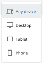
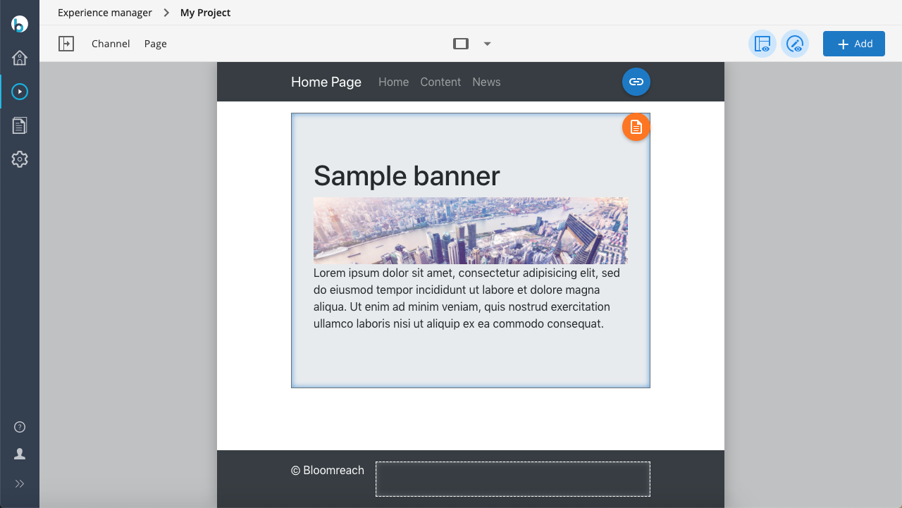
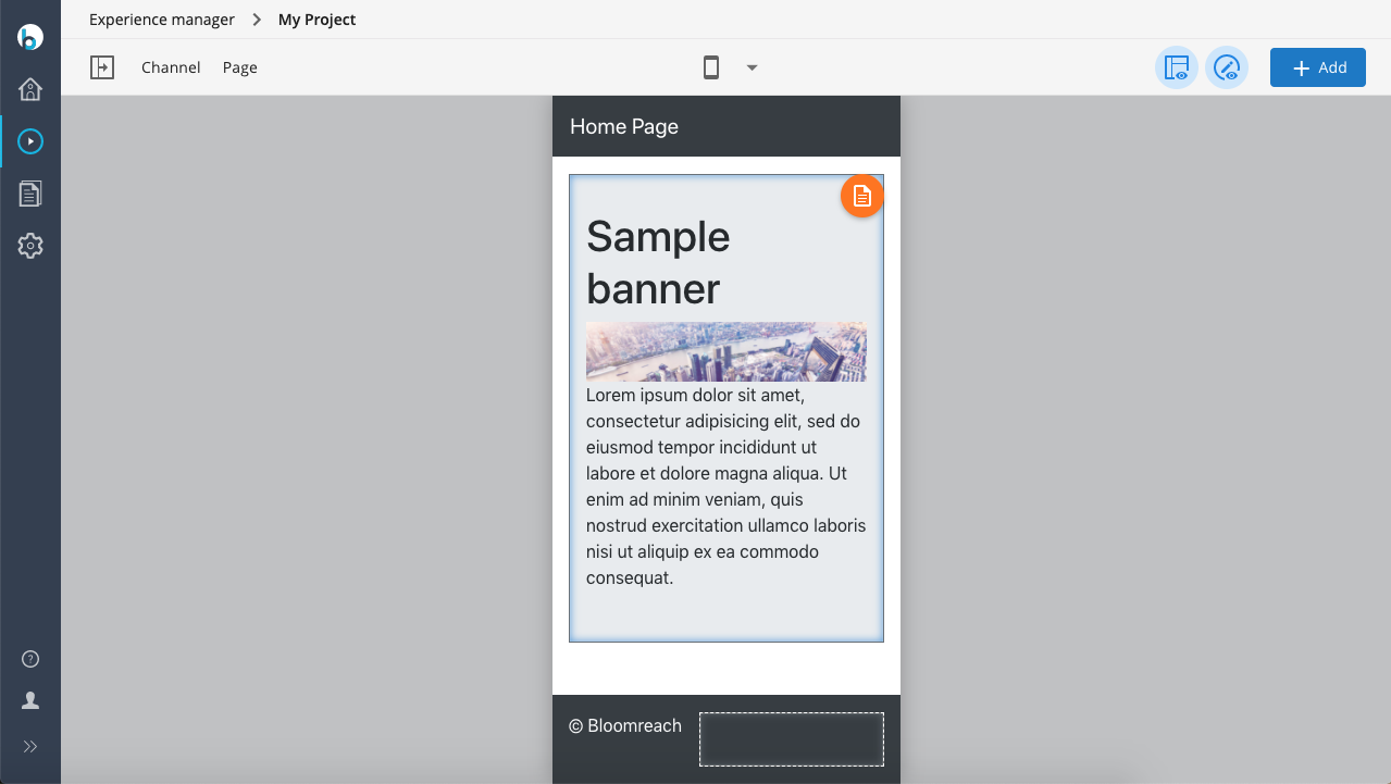
The Experience manager allows you to preview the pages of a channel for a number of viewport widths, in order to get an idea of how the website will look on devices other than a monitor, such as tablets or smartphones. By default, the Experience manager provides the following set of viewport widths:
- Responsive (unbound, page reflows when resizing the window or opening side panels)
- Desktop (defaults to 1280px)
- Tablet (defaults to 720px)
- Smartphone (defaults to 320px)
You can select from these viewport widths using the drop-down in the center of the Experience manager's toolbar.